AD SPAIN GRAPHIC EDITION
My experience
My time as a graphic editor at the AD Spain magazine was possibly the most comprehensive experience educationally, professionally and personally that I could ever had.
Enjoying the opportunity to work in one of the most recognized magazines in the world of interior design, architecture and art, not only nationally but internationally, and surrounded by such an inspiring group of professionals, it was a dream come true.
I had the chance to: develop my skills in graphic design and art direction, explore my creativity and play with the layouts, work with high quality pictures from the most beautiful houses, spaces and pieces of art in the world, participate in brainstorming meetings and bring new ideas, learn how a magazine is run from the inside, and know how a issue is made from scratch to printing.

Responsibilities
Selection & Retouch of images
In each section of the magazine that I was working on, I was given a folder with high quality images from a house, a restaurant, a gallery, some furniture... etc. I had to chose the images that I was going to use and then retouch them in order to make them look perfect. This meant: removing "ugly" stuff from the image (wires, ventilation ducts, grilles, plugs...), making some corrections (fixing old leather fabrics, reconstructing carpets burnt by the sun light or removing reflections in mirrors), adding a "magic touch" (a picture on the wall or flowers in a vase), and improving the photo in general (levels, curves, lights, shadows, temperature, color correction, etc.).
Graphic edition & layout
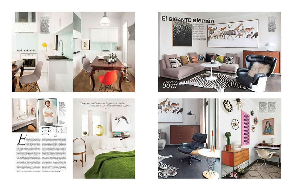
Once I had all the material to work with, the game started: trying dezens of combinations of layouts, choosing a typography for that specific section, placing the images and texts in each page, and sometimes designing customized items when necessary in order to make the presentation more special.
Doing "the wall"
I was in charge to print all the sections when they were finished in a DIN A5 size, cut them and put them on the wall by order of appearance in the issue so we could know how the magazine it was going to look like. This way we could have a whole view and reorganize sections easily and visually for then doing it digitally.
Organizing "the monster"
Finally, when the issue was approved (adverts, layouts, credits and internal order), I had to print all the pages of that number in a DIN A4 size and put them inside of a classifier following the real order of each page. It was huge and heavy, I guess that was the reason they called it "the monster". This point was critical because if there was a single mistake in this step, it was going to be seen in the printed magazine. I can tell that it was a "The Devil Wears Prada" internship's moment of responsibility, but having a super kind boss, so I didn't panic.
Gallery
Here you can see all the pages that I edited and the issues they belong to:


